
Case Study
THE Travelzoo website serves as a hub for millions of users around the world to find and purchase the best travel, entertainment, and lifestyle deals online. Its hotel booking platform allows members to search for deals on accommodations and book them directly on the website.
Project Overview
For Travelzoo hotel bookings, rooms-and-rates information can be very complex, especially when different rates and perks can apply to the same room type within a customer’s selected date range. User feedback and analytics indicated that many were confused by the room choices with multiple rates and perks. I worked with the Product Director to give the rooms-and-rates interface a user-centric refresh that would improve the way multiple and combined rates information are displayed.
Time frame: 1–2 months
The Team
- Product Director
- Senior Product Designer (Me)
- Travelzoo Dev Team
My Role
- UI Design
- Interaction Design
- Responsive Web Design
- Mobile App Design
The Challenge
The existing hotel booking rooms-and-rates interface suffered from some usability issues that could lead to user confusion at best and user abandonment at worst:
- Information overload that makes it hard to scan
- Lack of clear separation between room types
- Lack of emphasis on special rates and perks
- Call-to-action buttons the don’t clearly indicate what they do
- Haphazard spacing of elements creates visual confusion
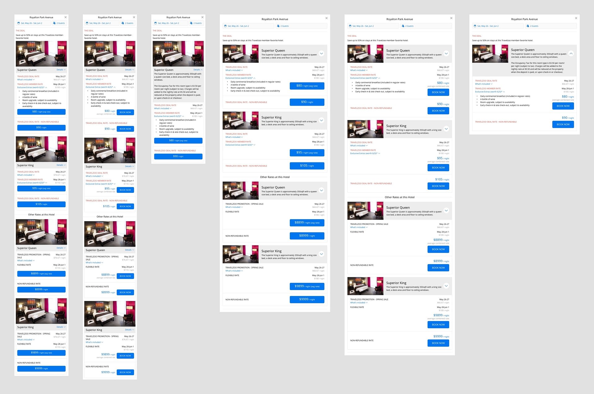
And when we add more information such as combined rates that have different nightly rates and perks, our usability problems get worse:

Competitive Analysis
Although I already had a few ideas to solve the problems, I wanted to see what other hotel booking websites (Booking.com, Hotels.com, Expedia, Marriott) were doing when it came to displaying combined rates and perks. With the exception of Hotels.com, most of them chose to hide the breakdown of nightly rates and only show the average rate.
But since Travelzoo differentiates itself from the big OTAs by negotiating exclusive rates with extra perks at partner hotels, it is important to emphasize those exclusive details and incentivize users to book through us rather than the OTAs.
Design Iterations
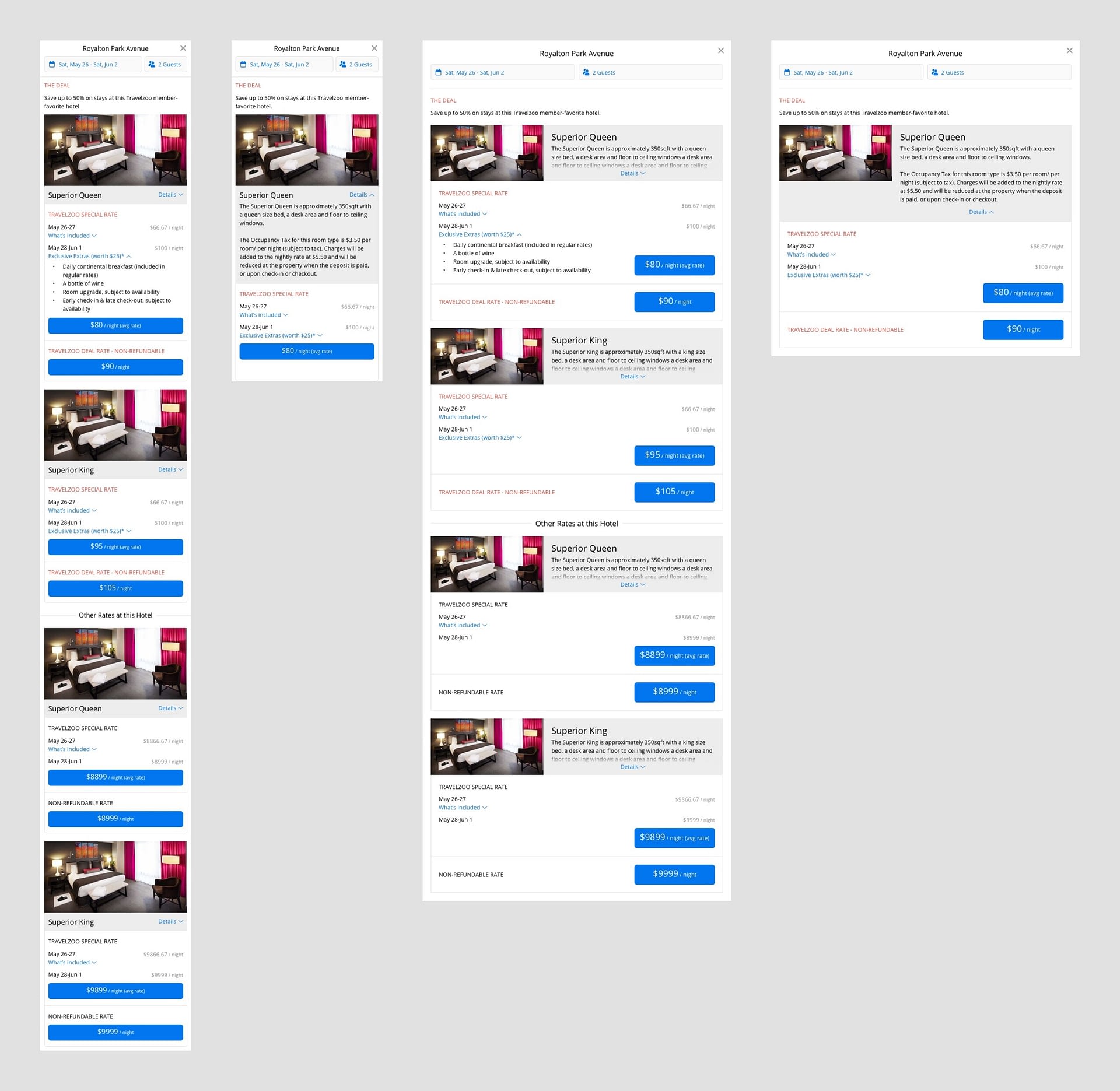
Round 1: my first attempt at addressing all of the usability issues and providing a couple of variations on the call-to-action buttons.
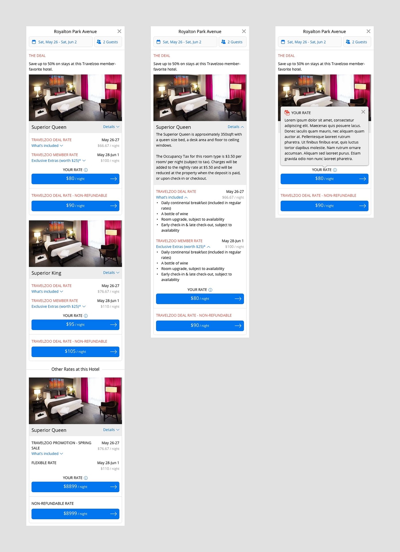
To break down my solution, I’ll focus in on one room type from above (the 2nd screen from left):

- To address information overload and improve scannability, I reduced information density by collapsing certain details that can be expanded with a toggle
- Special rates are emphasized with a red brand color, and perks—although collapsed—are emphasized with a blue interactive color
- A combined rate is labeled as such and its nightly rates are laid out and styled in a more scannable way
- A room type is contained in a card UI pattern to create clear separation from other room types
- Spacing of elements is “tighter” and more visually organized
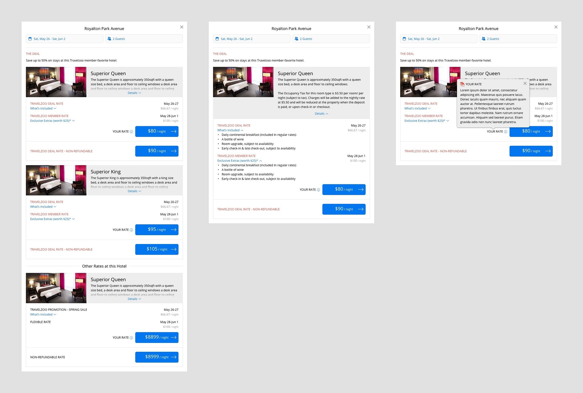
Round 2: I continue to iterate on the UI …
- I suggested consolidating the special rate title (in red) to simplify the UI but the Product Director said it would create more technical complexity rather than less.
- For the UI on larger screens, I designed a better pattern for the “Details” toggle that expands the room type information.
Round 3: I focused on designing the “Combined Rate” UI in order to provide useful information and be transparent about rates, which helps to reinforce Travelzoo’s customer-first business and product approach.
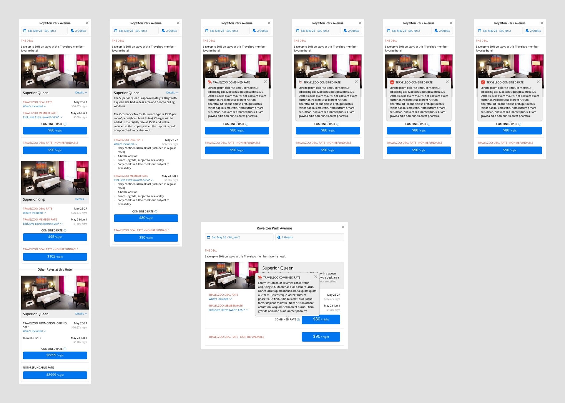
- I determined that a pop-over on click/tap would be the best approach to display the information.
- Adding an icon next to the title of the pop-over helps to visually describe its content and also makes it more distinctive. I created several variations for review to see which would work best.
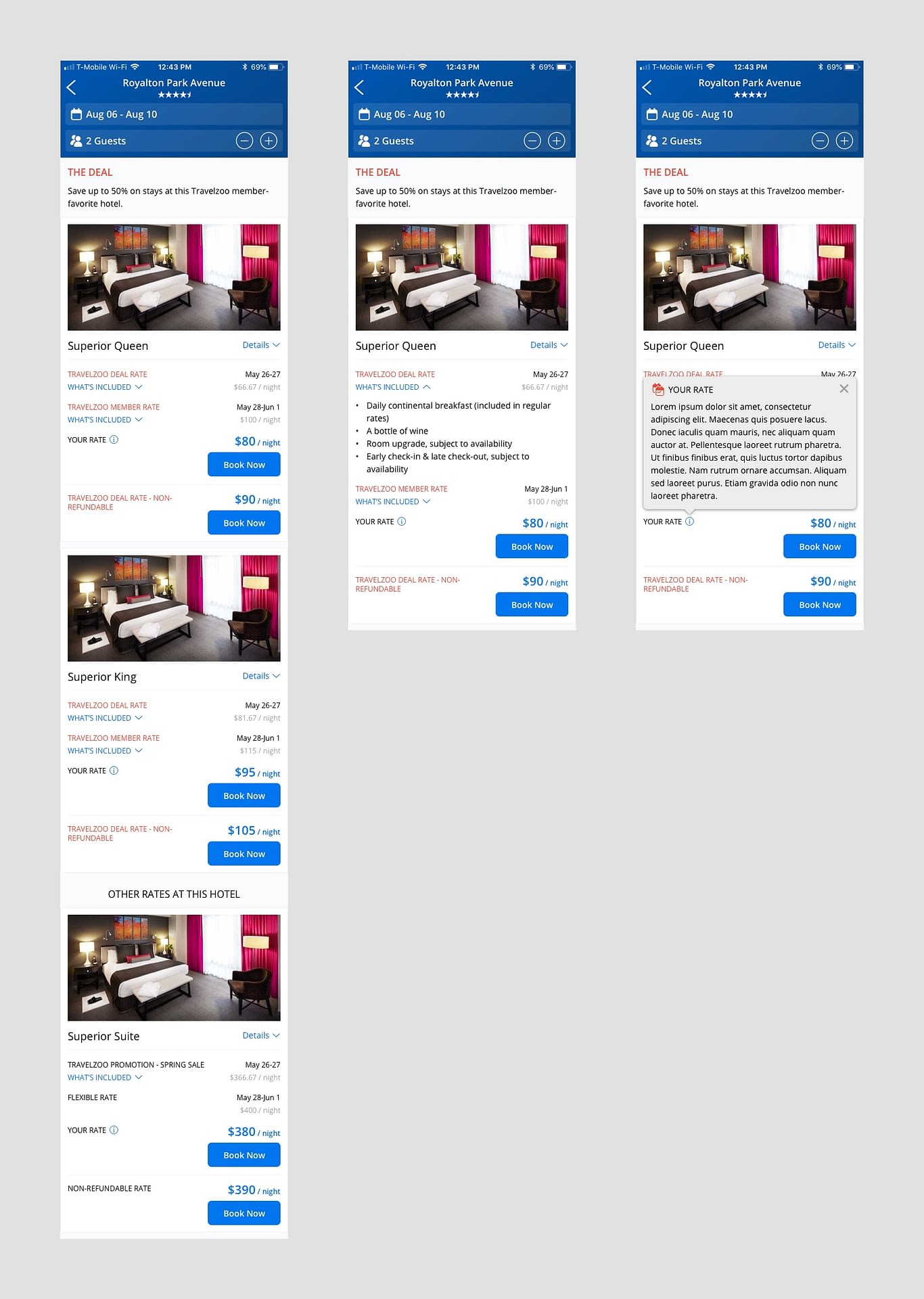
Round 4: I focused on improving the call-to-action buttons that begin the checkout process.
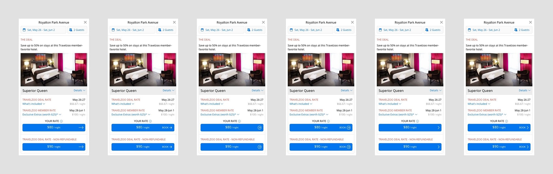
Although it seemed relatively intuitive that a rate inside a prominent button would imply “book at this rate,” there was an opportunity to make it even more clear for users.
- Adding an arrow: since browser and mobile app users have become accustomed to using rightward arrow buttons to trigger “next” or “go” actions, we could utilize the same UI pattern on our call-to-action buttons to improve usability. I created several variations for review to see which would work best.
- Adding action text: I also created variations with “book” text to provide even more clarity.
Final Hotel Booking Combined Rates UI
Outcomes
The updated user interface was successfully implemented and shipped, with business stakeholders and internal users complimenting that it looks better, more organized, and easier to scan. I hope to get quantitative data on end-user impact soon.
Next Steps
I plan to work with the PMs to optimize conversions by A/B testing a few variations: expanded details vs. collapsed, “Book Now” vs. nightly rate CTA text. The work to improve hotel booking UX never stops, however, and more user studies and product enhancements will be needed in order to build user trust and loyalty that sets Travelzoo apart from its competitors and the OTAs.
Thanks for reading! 🙏