
Case Study
TRAVELZOO serves as a hub for millions of users around the world to find and purchase the best deals on vacations, hotels, restaurants, spas and more. Users can access its deals through the responsive website or the native iOS and Android apps which provide the best user experience on mobile phones.
Project Overview
Most hotel booking deals on Travelzoo are time-limited and the information about when deal prices are valid appear in the rate details box of the deal page on the mobile app. The details can be rather lengthy on some deals, however, making them difficult to recall when a user has opened the calendar view to select the dates of their stay. Finding a solution to this problem would improve usability of the mobile app to book hotel deals and create a better user experience.
The Team
- Product Manager
- Senior Product Designer (Me)
- Mobile Apps Dev Team
My Role
- UX/UI Design
- Interaction Design
- Mobile App Design
- Rapid Prototyping
The Challenge
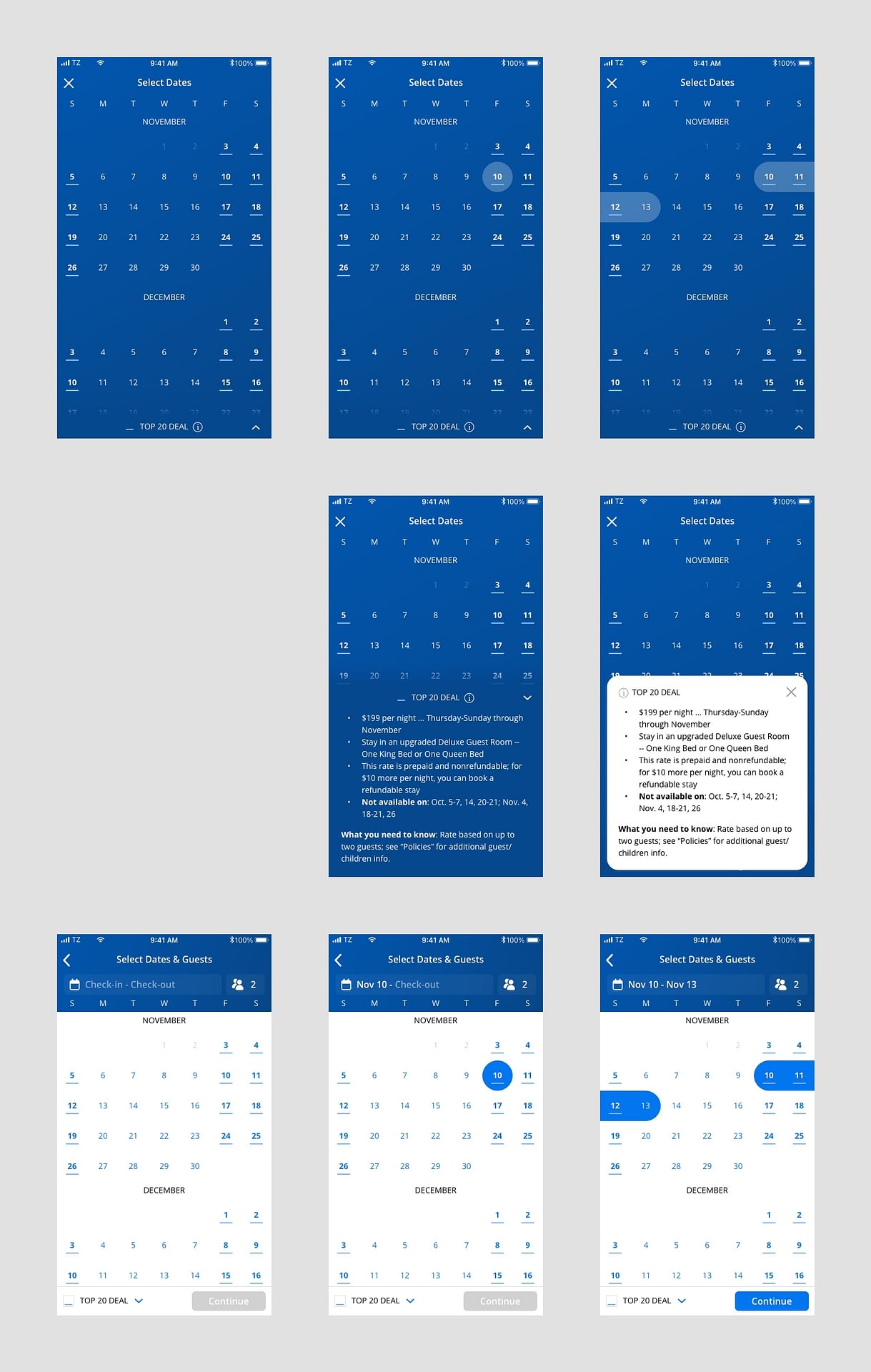
To understand the problem, let’s look at the original deal booking flow below:

- The first problem is with screen 2, a help dialog to remind users about the rate details. It is helpful information, but shown in an inelegant way and aesthetically unpleasing.
- After dismissing the help dialog, the rate details appear again on the ensuing screen, but with additional information after the bullet list. Showing the full rate details is definitely good for the user, but the execution could be better.
- Also on screen 3, it’s unclear that the next step should be “Choose Dates.” If a user taps “Search” before choosing dates, an error alert appears with a message to choose dates first. That’s not an intuitive user experience.
- Then in the calendar view, users would have to recall the rate details in order to select deal-valid dates. If they forget, they’d have to close the calendar to refer back to the rate details and then reopen it to select dates. That could be a frustrating experience.
The Solution
Make the calendar do more than just show and select dates. Below are my initial UI mockups of the updated deal “validity” calendar, showing different interaction states and style/layout variations:
After reviewing with the Product Manager, we decided to proceed with the blue background design to keep visual consistency with other calendar views and save on development time.
Additionally, the rate details toggle appeared camouflaged and could easily be missed by users since its blue background blended too well with the calendar behind it. So I worked on another round of iterations to improve the UI:
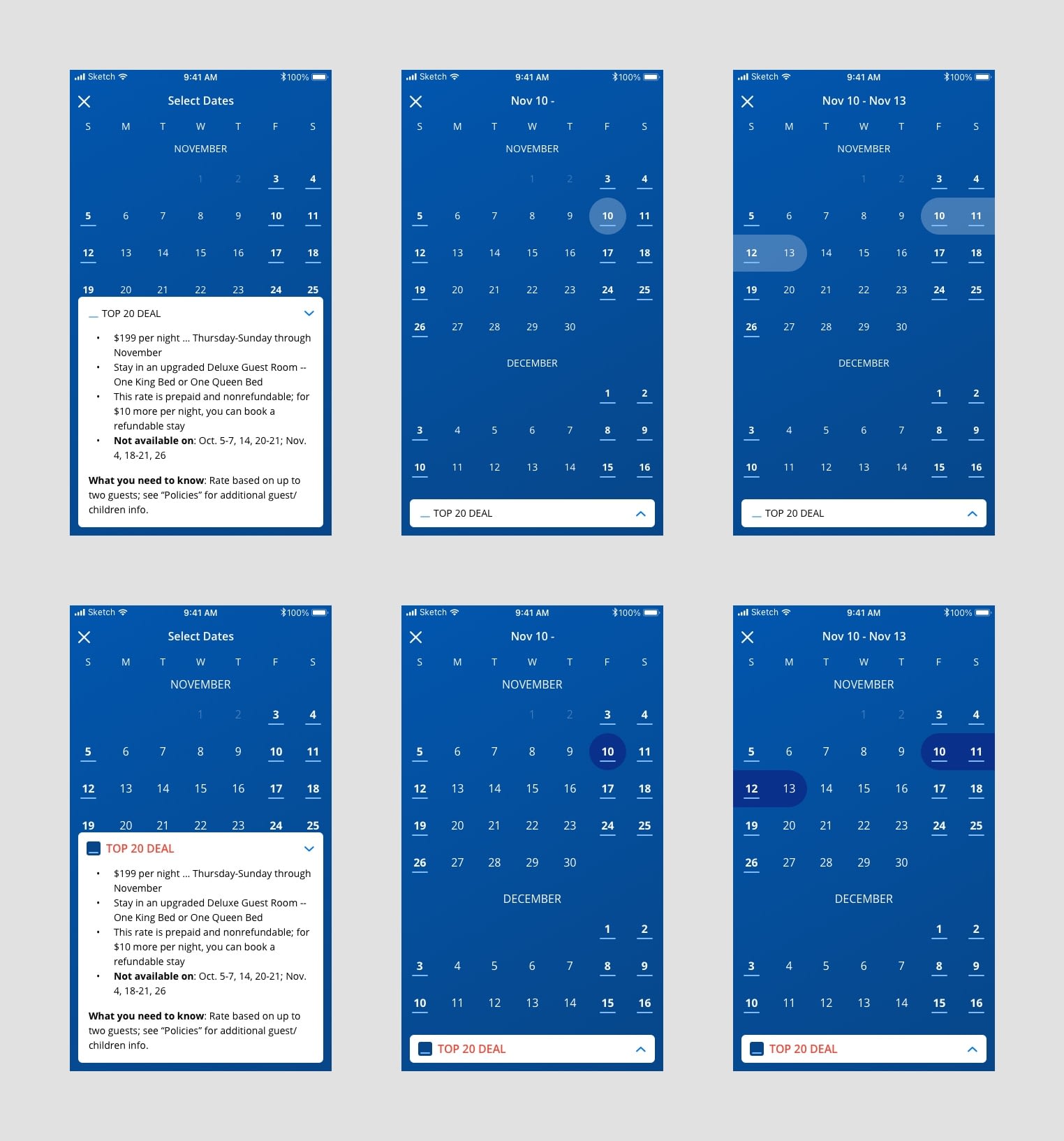
The bottom set had the most clarity so that was the design chosen by the team to develop. Here’s a closer look at the key changes made to the deal booking flow and calendar:

- Change the call-to-action button text on the deal page from “Book Now” to “Check Dates,” because that’s the next first step to booking
- Bring up the calendar view immediately after the user taps “Check Dates”
- On the calendar, highlight the dates when deal prices are valid and display a key for users to understand the highlight
- Provide easy access to the rate details information from the calendar
Now with a more informative calendar, the unusual help dialog from the original flow can be removed to create a more intuitive path for booking a hotel deal:
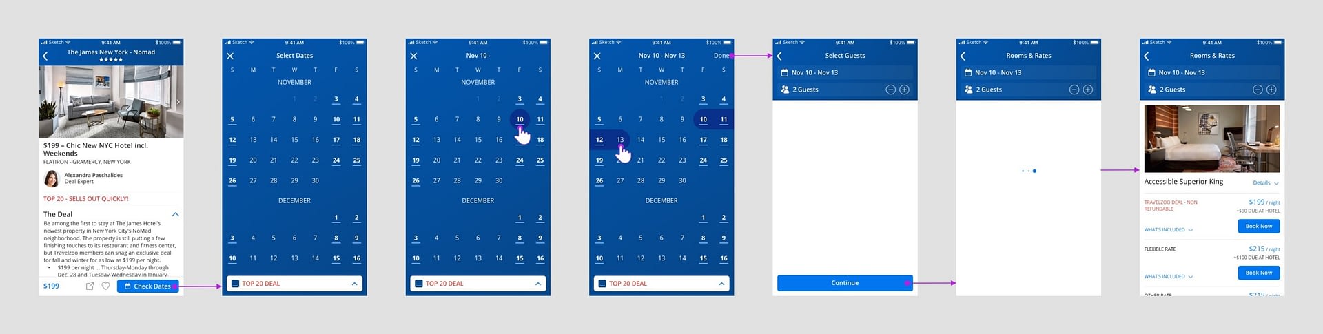
Final Deal Validity Calendar Booking Flow Prototype
Outcomes
It turned out that developing a native mobile experience of the deal validity calendar was more technically challenging than originally determined. The development team decided to try implementing a mobile web view of the calendar but it had performance issues that needed to be resolved before going live. That resolution is still in progress.
Learnings & Next Steps
More UX improvements can still be made to the deal validity calendar. For instance, the sparse screen for choosing the number of guests after dates selection is still unintuitive (left screen below). I’d like to eliminate that screen by adding the dates and guests fields to the header of the calendar (right screen below). That might create a clearer and faster path to booking, which benefits everyone.

Thanks for reading! ✌️