
Extended Case Study
STORIES is Travelzoo’s rebranded blog, providing informative and inspiring original content related to travel, entertainment and lifestyle. It’s a product that was created to complement Travelzoo’s primary business of selling travel-related deals, and comprises editorial and sponsored content.
Project Overview
Travelzoo’s original blog was seeing growing user engagement and sponsor revenue, but it was missing features, technology and aesthetics that would allow it to expand and increase its value to users, partners and the business. A project team was put together with a mission to “dramatically improve our digital story-telling abilities” in order to make Travelzoo membership more attractive and create a mutually beneficial cycle of deals enhancing stories, and stories enhancing deals. That meant a replatforming and redesign would be necessary, as well as new UX/UI solutions to effectively and efficiently integrate deals content within stories, and vice versa. We had an aggressive timeline to finish within two months (during peak winter holiday season no less). To accomplish that, the project was broken up into phases, with phase 1 launching only MVP features.
Time frame: 2–3 months
The Team
- Head of Publishing
- Head of Marketing
- Senior Editor
- Business Development Manager
- Lead Software Architect
- Senior Product Manager
- Senior Product Designer (Me)
My Role
- UX/UI Design
- Interaction Design
- Responsive Web Design
- Prototyping
- Frontend Development
The Challenge
The initial market and user research were already completed before I became involved. At the kickoff meeting, we received a project summary that included user feedback, personas, content strategy, and data to back up the effort.
On a high level, the design principles for Stories were: travel is emotional and inspiring, so reading stories about it should elicit the same feelings through visually compelling, interactive, authentic, and useful content. At the same time, stories should also be easily browsable and shareable. Relevant travel deals should be offered at the right places within a story, but they should enrich the story, not spoil it.
Additionally, the following issues with the original blog had to be resolved:
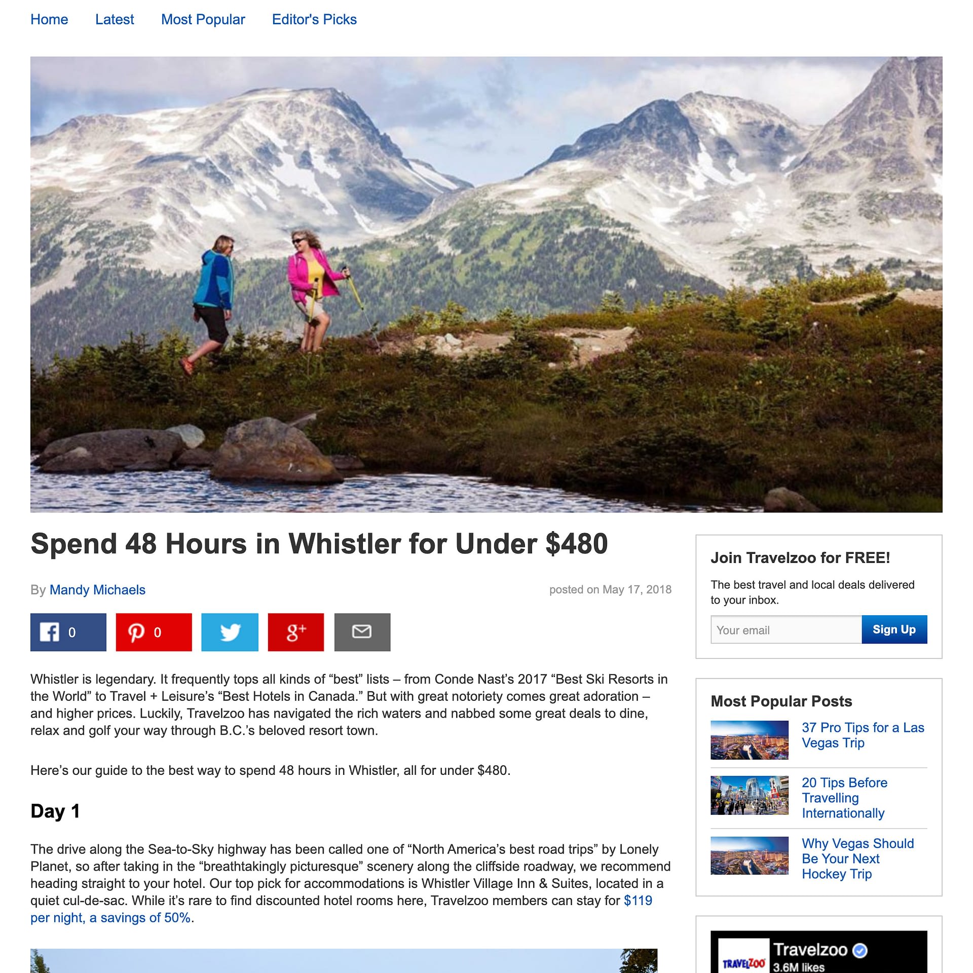
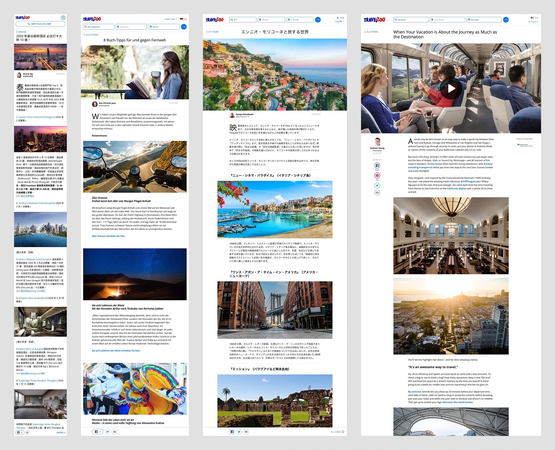
Article page
- Visual inconsistencies with the rest of the site: typography, colors, shapes, grid, etc.
- Body text too small for readability
- Images too small and low resolution
- Visual clutter created by elements that are mostly ignored
- Lack of design and functionality for showing relevant deals
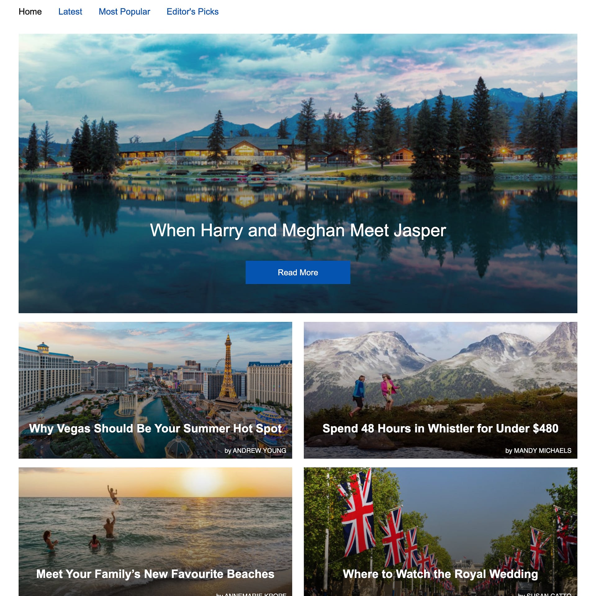
Browse page
- Visual inconsistencies with the rest of the site
- Compromised readability of headlines and bylines when overlaid on photos
- Weakened impact of photos caused by dark overlay to make text more readable
Other Design Factors
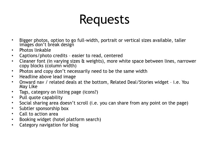
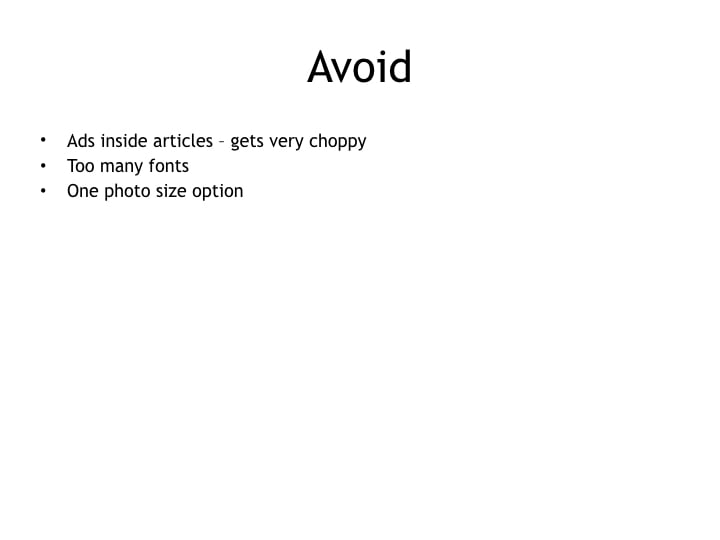
Stakeholder requests
Besides project team members, there were stakeholders outside of the team who provided their wishes for the product design as well. Below is a small sample of their requests:
Technical constraints
Since the original blog was on a WordPress hosting service, all of its data would have to be migrated to Travelzoo servers and converted to work on the new platform. That meant the new design would have to be able to elegantly display old blog posts next to new ones, with as little “old” artifacts as possible. An internal CMS also had to be built for the new Stories platform, but its (limited) phase 1 features also constrained potential designs.
Inspiration & Competitive Analysis
For inspiration and reference, I looked at various travel, information, news, and blog sites with good aesthetic and usability qualities, along with unobtrusive advertising and cross-promotion features that could be applied to Stories. I focused my attention on sites that were designed well for reading, inspiring, informing, liking, sharing, and saving. My team also provided references, citing features or visuals they liked. Below is a small sample of the sites referenced:


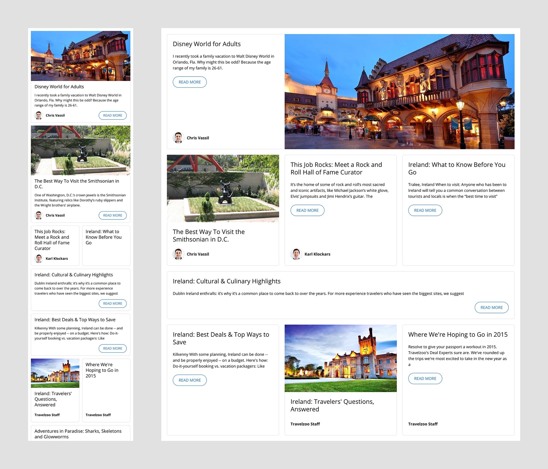
Designing the Article Page
We began with the article page because it was the most common entry point into Stories, and therefore, the most critical to improve.
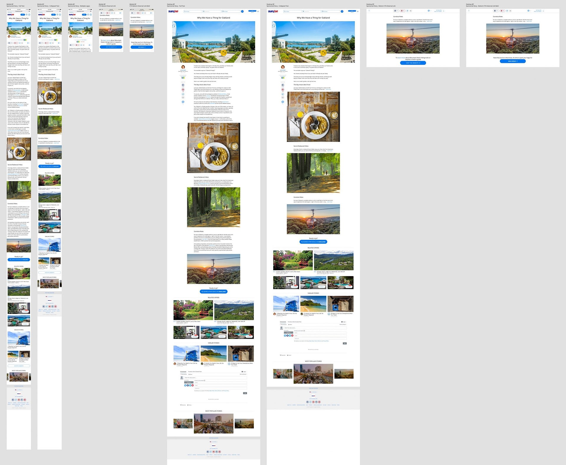
By applying our existing web style guide and UI framework, we were able to easily and efficiently fix the visual inconsistencies (typography, colors, shapes, grid, etc.) of the original blog.
Body text and white space
Once we had consistency, however, I felt that it was a good opportunity to “stretch” the style guide a bit and evolve it for Stories—but not too much because of time constraints and the risk of a longer approval process if more dramatic changes were made. The first “stretch” was making the body text font size larger for articles than the global default, in order to improve readability. Along with that, more white space was added to the left and right gutters on mobile:

Default body text and gutters 
Larger body text and gutters
I was also aware that as the screen size gets wider, it would be necessary to limit the width of the body text in order to maintain readability. Based on a measure (line length) of 15 words, I settled on the following grid rules based on device break points:
- Tablet: 10/12 columns
- Laptop: 8/12 columns
- Desktop: 6/12 columns

Line length grid tablet 
Line length grid laptop 
Line length grid desktop
Images
The next challenge was image and video presentation. One of the easiest and effective ways to make a page more emotional and inspiring is to show large, high resolution photos and videos. However, the larger its size, the slower its load time and page speed, so striking the right balance between size and performance would be key to creating a good user experience. To complicate matters, the original blog contained mostly small, low resolution photos that could not be easily exchanged for high resolution ones during migration to the new platform. I tried scaling them up, but the resulting rendering artifacts were unacceptable to the team. The compromise we made was to display low resolution photos up to the maximum width of the body text…

…while displaying high resolution photos in a larger, sharper (2x), and more inspiring way, but with responsive web and javascript techniques (lazy loading, size/resolution detection) to ensure quality and performance:


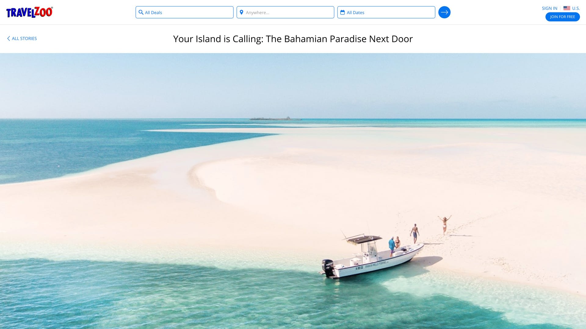
Lead image (hero)
The leading image was special, however, and needed to draw in the reader, enticing them to read further. Displaying it as large as possible seemed like the obvious thing to do, however, there were some issues to consider:
- The photo team was using a backoffice tool that automatically capped the maximum width of uploaded photos
- Some stakeholders worried about “pushing” content too far down the page if the leading image was always full width, requiring too much scrolling
- Performance impact of loading a potentially very large image near the top of the page
Since we were technically constrained by the backoffice tool, if we wanted to display the lead image always at full width, we would have to accept scaling up no matter how large the screen:
Definitely immersive and worth refining, however, when comparing it to a lead image with a capped width set by the UI framework grid, it wasn’t convincing that full-width was necessarily better:
So we decided to forego the full-width lead image for a later time, when we would be able to remove the technical constraints and perform A/B tests to decide what users respond better to.
Videos
For videos, since most are embedded as iframes from third-party sites like YouTube and Vimeo, we only had to worry about proper responsive sizing, not performance impact. With my input, our lead engineer implemented responsive video embeds that matched the sizing rules we defined for images:

Share bar
To encourage more sharing, I tried a number of styles, layouts and placements. Below is a small sample of my many mobile mockups:

After reviewing my mockups with the team, we settled on a sticky placement at the bottom of the viewport, and used styling that was consistent with existing share buttons on our deal pages:


On desktop, the share bar is initially visible on the left sidebar (again, for consistency with deal pages). But once the user scrolls past it, the bottom sticky share bar should be visible, so I wrote the frontend code to make it gracefully appear:
Since the sticky share bar is only relevant when it appears within the frame of the article, it shouldn’t remain “sticky” past the article. So I wrote the frontend code to gracefully position the bar statically once the bottom of the article is reached during scroll:
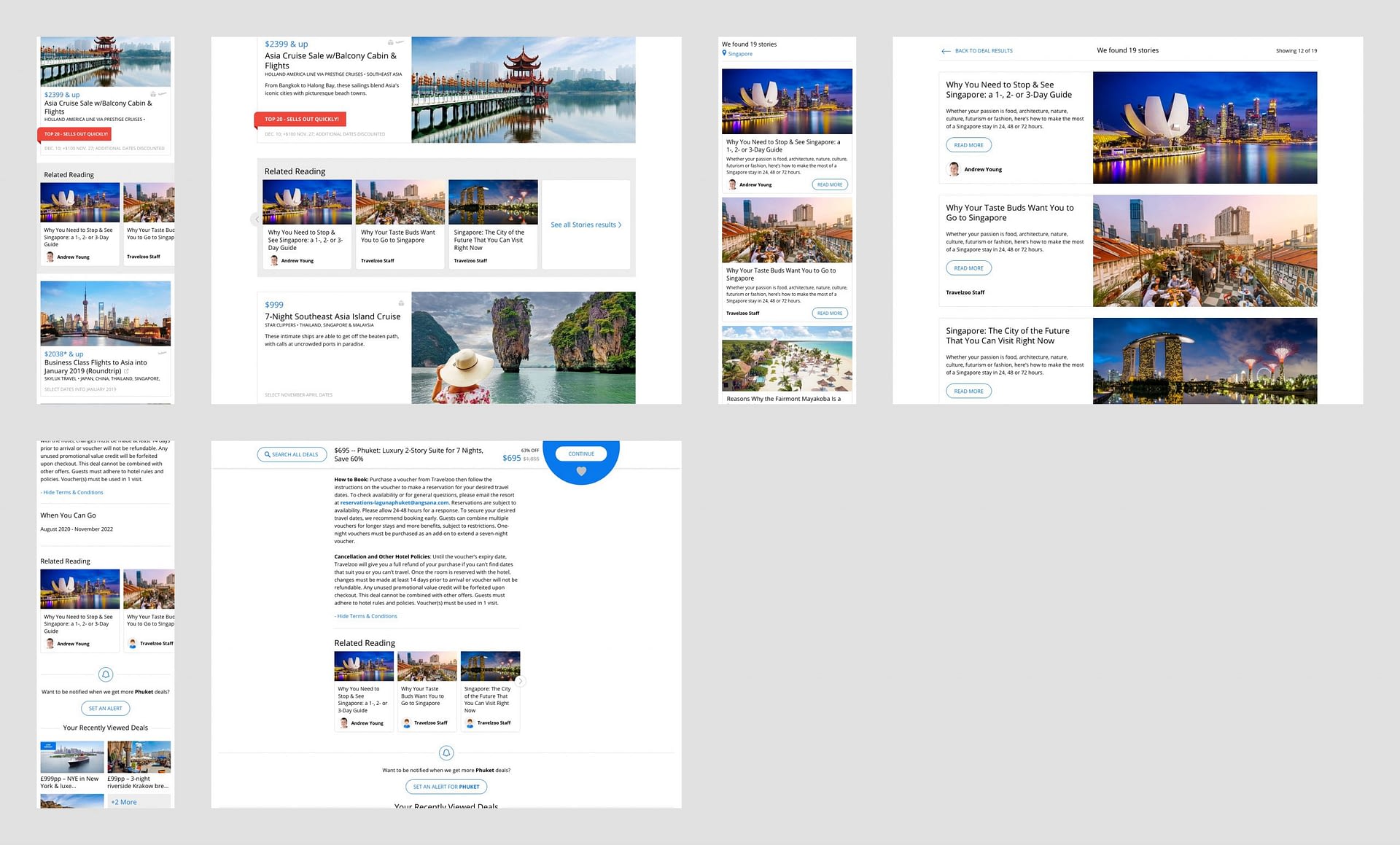
Related Deals Widgets
The original blog had two major problems when it came to promoting relevant deals within a story:
- Only two design options existed: an inline text link, and a bordered box with custom text and links
- Expired deal links remain unless manually updated, creating a bad user experience and potentially impacting SEO
I worked on designing two solutions:
- A flexible module for linking to a single deal
- A flexible module for linking to multiple deals
Single deal widget
Because the original blog contained customized deal CTAs, I started ideating on design templates to improve their appearance and effectiveness:
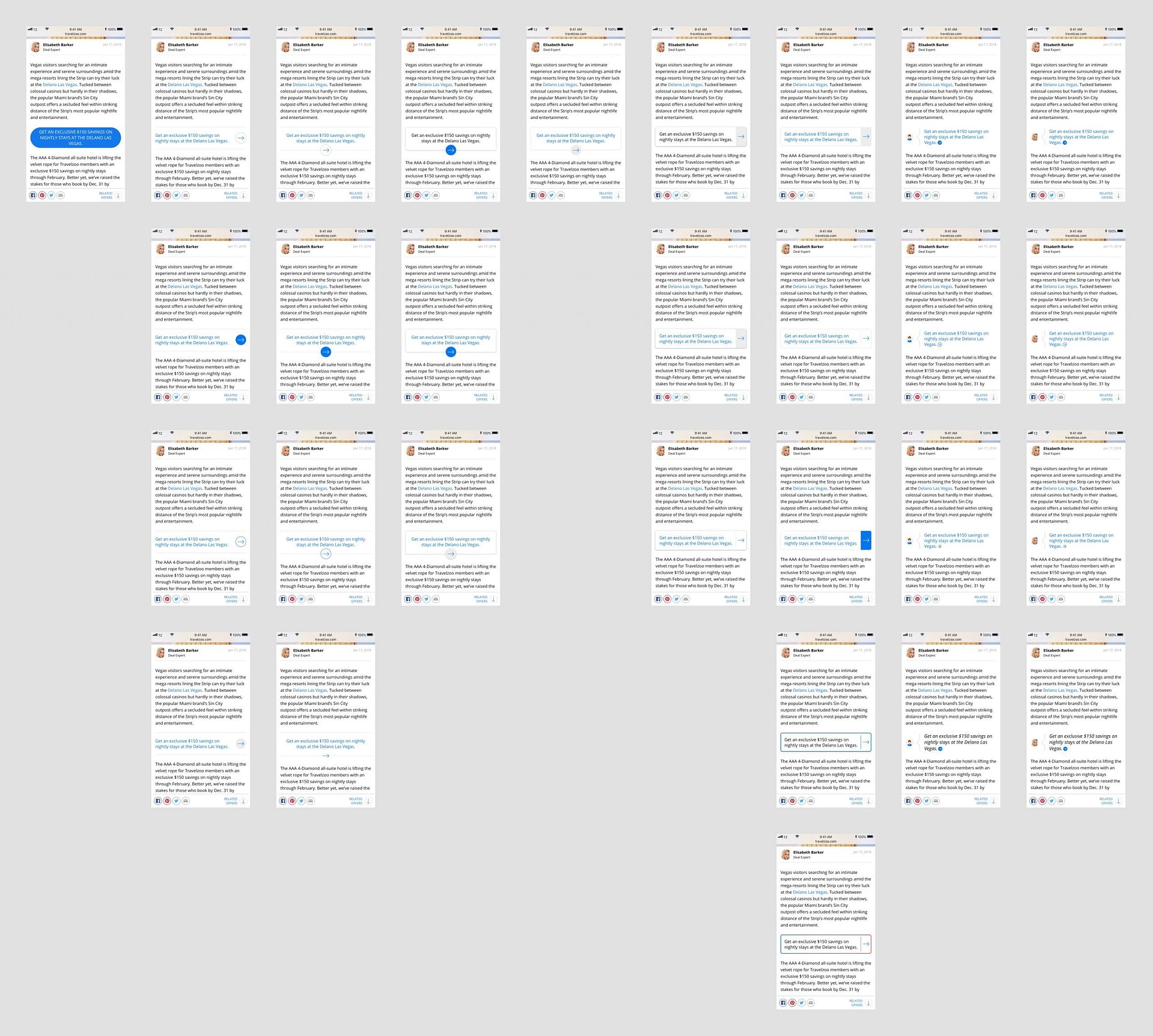
Despite the effort, my first attempts to provide solutions for deal CTAs with customizable text were completely rejected! They said we needed something much easier, a way for publishers to inject a deal simply by providing its ID number.
Since I had a good understanding of the data structure of deals (from experience), I knew what data I could pull into a single deal widget, and designed these potential solutions:
Because of its modularity, if the deal expires later on, it could be programmatically removed from the page without affecting the content around it or the story, which saves human resource hours while improving UX and SEO.
After reviewing my designs with the team, the second “card” design got approved:
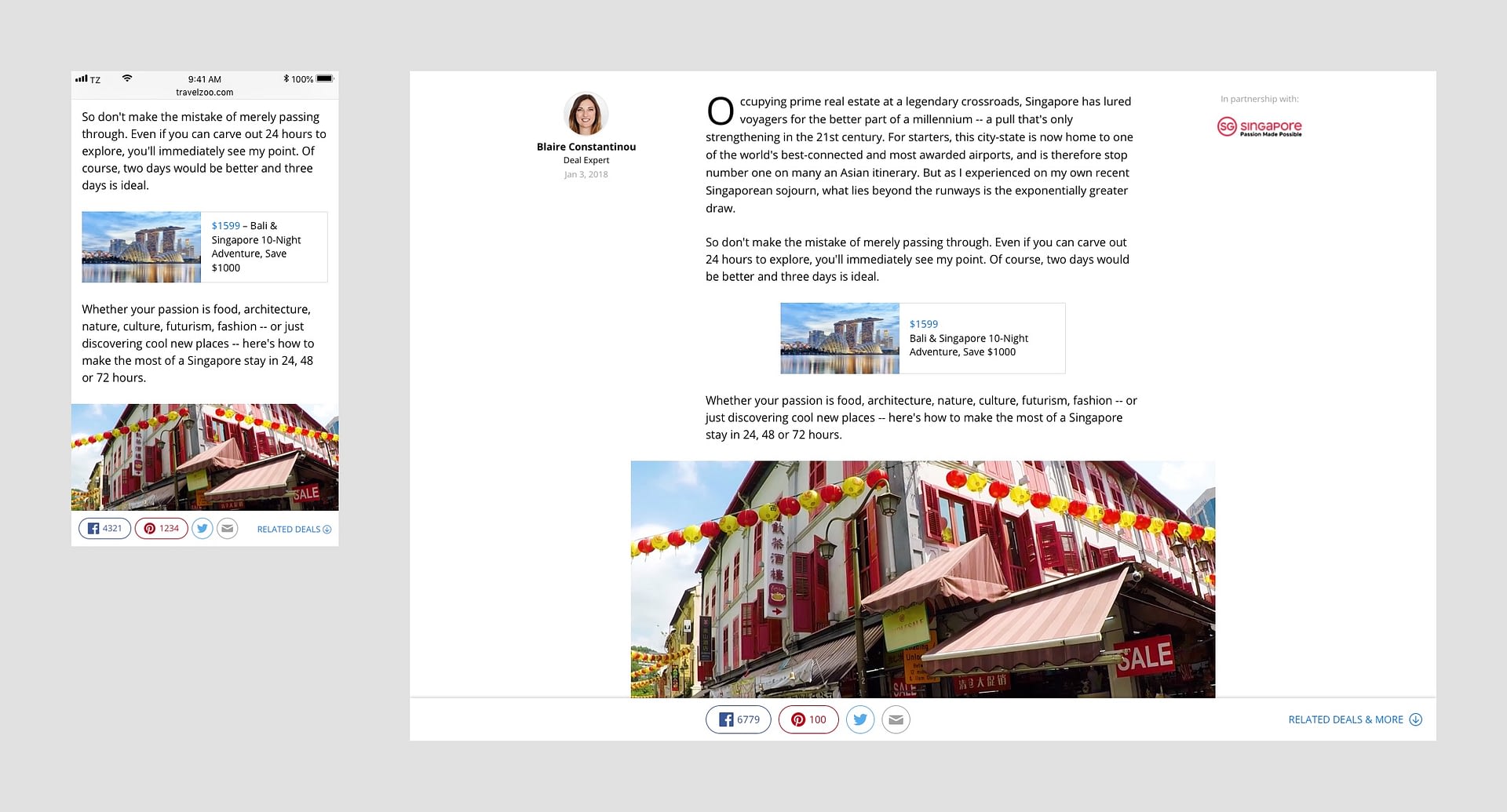
I even created a web prototype to experiment with animation effects that draw attention to the deal when its scrolled into view:
I wasn’t alone in expressing my concern about this design looking like a display ad, however. The rationale for choosing that design was because it clearly distinguished the deal from the article, which the publishing team preferred. In the meantime, we could track the conversion metrics and potentially A/B test other designs in the future.
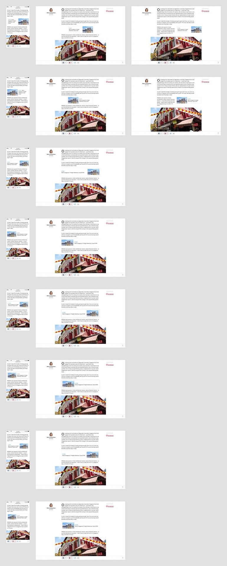
Multiple deals widget
The publishing team also asked for functionality to inject a group of deals into an article, either by using a shortcode or inputting a list of deal ID numbers. I designed these potential solutions:
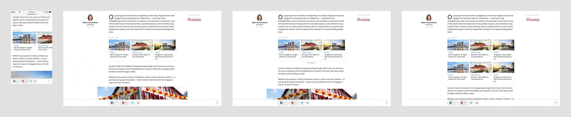
After reviewing with the team, the carousel widget version got approved for desktop along with the mobile version. I worked with the engineer to implement the carousel widget so that it supported both touch gestures as well as button clicks to scroll through the deals.
On mobile, rather than vertically stacking the deals or using previous/next buttons to browse, I opted to use native touch gestures to horizontally scroll through the deals, as it seemed the most natural and efficient, and wrote the frontend code to implement it:
Final Global Article Page
Designing the Browse Page & Story Cards
Story cards
Because Stories content had to be integrated into the core site experience (deal pages, search results, etc.), it was necessary to design a reusable and consistent template for story “cards” that could be used everywhere, including Stories browse pages. So, before designing the browse page, I began ideating on story cards, a small sample of which is below:
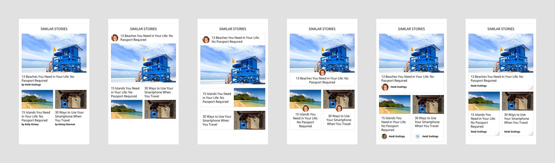
From the feedback I received, it was clear that a profile picture of the author was the direction most people liked as a distinguishing characteristic of a story card. But no one could agree on what to display if no profile picture was available. I tried numerous icons and even a gender neutral illustration of a human, but all were rejected:
By the end, we simply decided to show no profile icon at all if a picture wasn’t available.
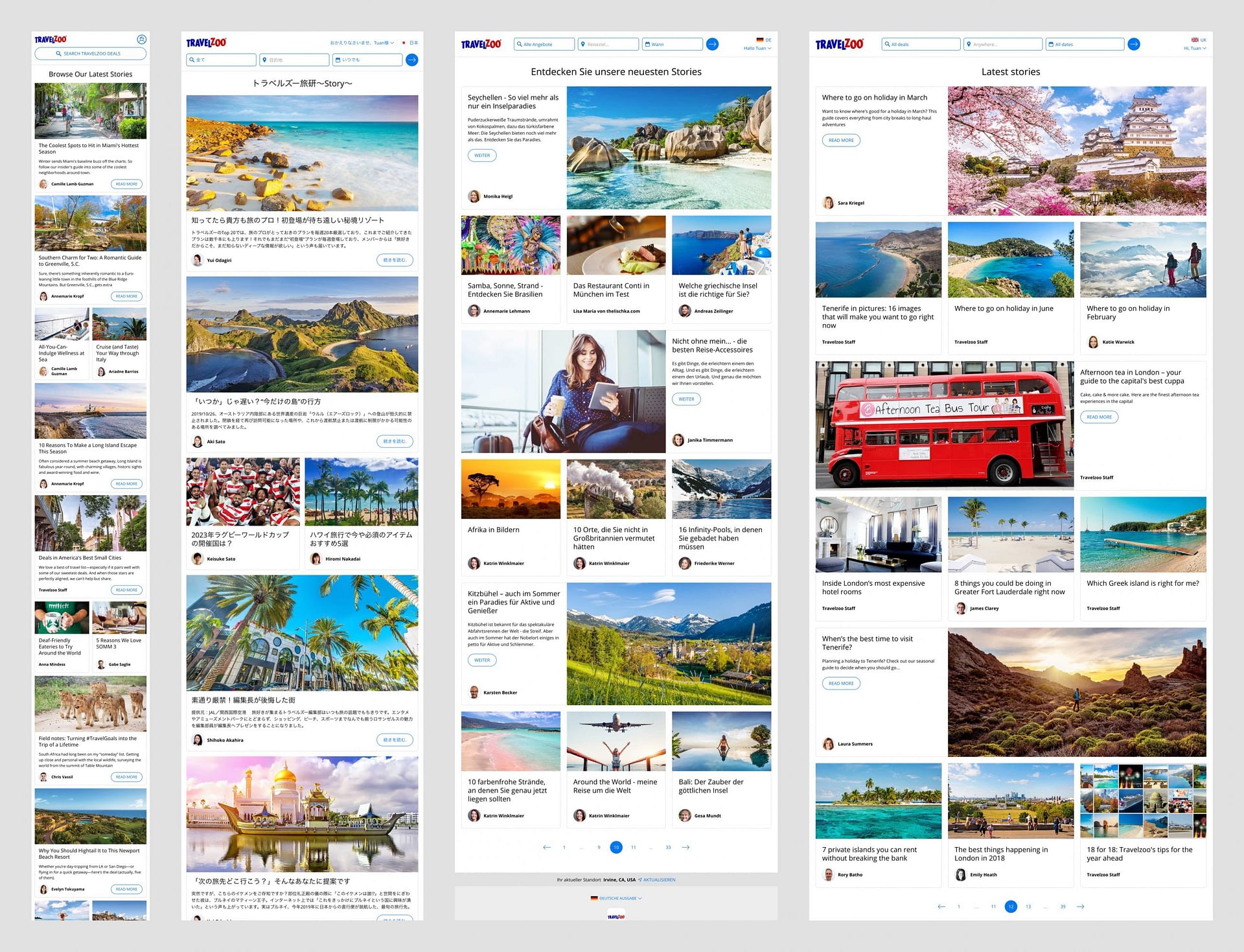
Stories home & browse pages
Since I had a solid story card template to use, I began ideating on the home and browse pages. And because the template design didn’t have text overlapping images, the aesthetic and usability concerns of the original blog’s browse page design were effectively resolved.
Unlike article pages, browse pages had very few requirements, so I was more free to explore design ideas that would inspire and engage users.
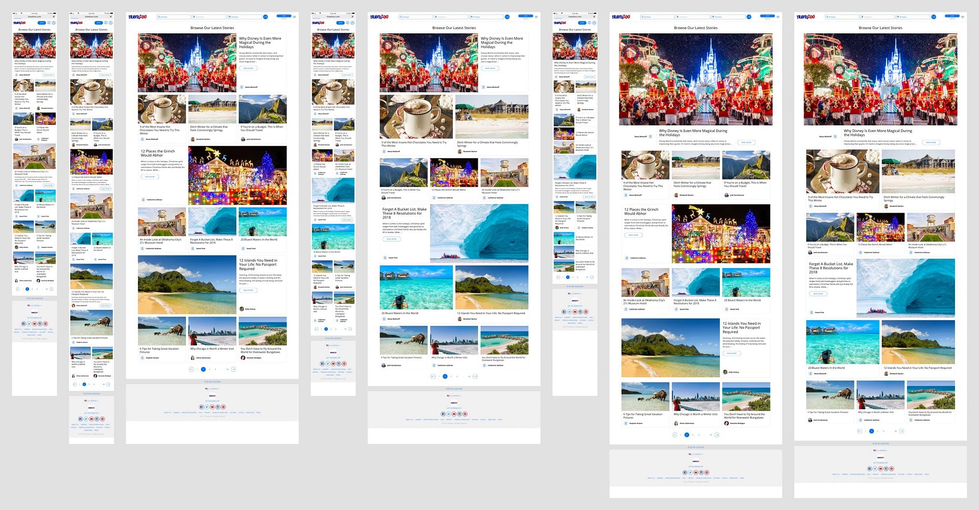
There was interest in having a “featured” story card that stands out, however, we decided to push that idea to phase 2 when we would have more time to flesh out the details.
A technical detail that had to be resolved was how to display a story card that didn’t have an image. I considered using a placeholder image, however, because of the prevalence of the issue on older blog posts, displaying multiple placeholder images on the same page could look repetitive. Since only older blog posts were affected and buried deep in the pagination anyway, we decided to simply show no image if one didn’t exist:
I assisted our lead engineer with the complex frontend layout code of the browse page, utilizing CSS flexbox and avoiding unnecessary javascript.
Story cards site integration
I won’t go into detail about the integration of Stories into the core site (that’s another case study!) but it’s relevant to show how the story card template was implemented on other pages. The heading we used when displaying Stories on other pages was “Related Reading”:
Final Global Browse Page
Outcomes
At the 1-year anniversary of the launch of Stories, one of the team leads sent out a mass email celebrating its success:
Moving off of WordPress to the in-house Story Tool allowed us to take advantage of a lot of synergies, including …
- Posting related offers alongside relevant story content
- “Flying-in” deals into the middle of story content
- Adding published stories into our accounting reports, so we no longer had to hack the system for the revenue to populate
- Connecting stories organically to our search activity on the site
- Placing stories on the same tagging structure as deals
- Supporting custom video inside stories
- The same tool and base code structure for 12 country editions, allowing us to share content between countries much easier
In the US, we’ve had more than
confidentialM page views in the last year, with a time on page increase of 30% and a bounce rate improvement of 9.6%.And the tool has been the backbone for $
confidentialM of US Stories revenue over the 12 months.
Learnings & Next Steps
Despite the success of Stories in certain regions like the U.S., the product didn’t necessarily meet the business needs of other regions. The team in Germany, for example, had less success selling Stories and asked for a whole different product altogether. That’s the difficulty of running a global company with a small product team centralized in the U.S. To meet the business needs of other regions, localized product teams might serve better. But then again, that could lead to fractured, inefficient, and inconsistent products, unless those teams communicate and collaborate often.
But Stories can still be improved, and made to work better for all regions. A new template for an image gallery “story” is in progress and other templates could be developed to create more immersive and interactive content in the future. And the existing product can be optimized in many ways with experimentation and A/B testing.
In the meantime, be sure to check out Travelzoo Stories and thanks for reaching the end! 🍾